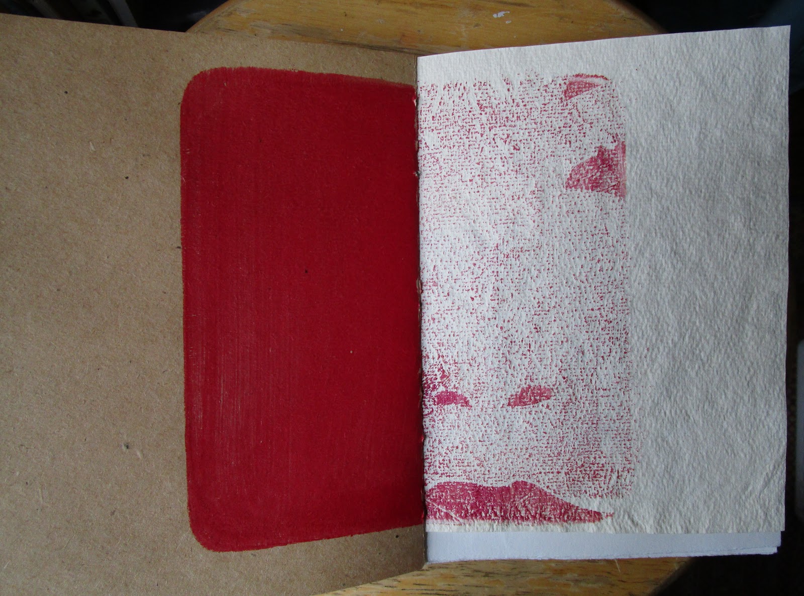
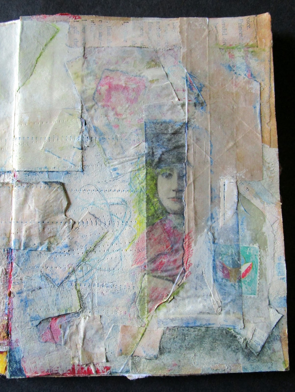
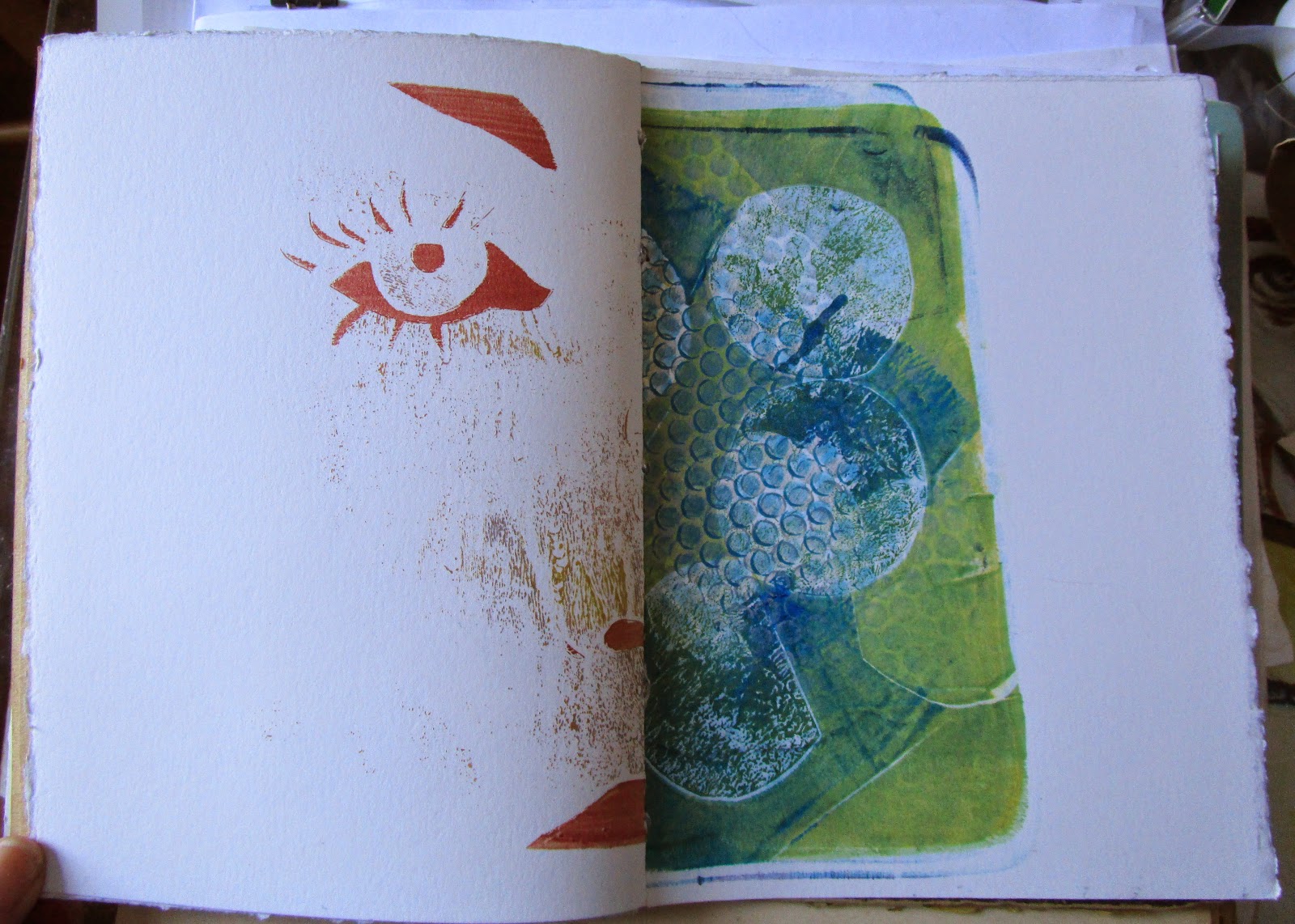
The covers were blank, and ended up looking like this:
Front Cover
Back Cover with a quote from F. Scott Fitzgerald that I love to look at. The last line of The Great Gatsby.
Showing posts with label journals. Show all posts
Sunday, November 22, 2015
Saturday, November 21, 2015
Journal 4 Last two pages
These were the last two pages in Journal 4
The background were some Appalachain Trail maps that had elevation lines drawn on them. That was the background on the left and I added a bigger MOO card separation.
The right side was a last MOO card separation and I wanted to leave the background print visible.
Thursday, November 19, 2015
Journal 4 Pages 21 and 22
This "Before" gave me a problem by not matching until I realized this was the other side of the place where I removed the small page. So, you will have to imagine that the little page with the red squares is not there.
Another separated MOO card started this page out.
And this was the other side. I struggled with wanting to make the space behind the figure darker. I wanted her to be walking into the light, but maybe it needs a darker space behind it despite the "story" I see here...
Wednesday, November 18, 2015
Journal 4, Pages 19 and 20
Lots of dark colors here to use,
This was another MOO card separation on the left, but I do like what I did there better. The integration is a bit more effective to my eye. It is from a photo I took years ago of the Coney Island Wonder Wheel, and the woman on the right small insert page is from an article I tore out years ago from somewhere about suffragettes.
The flip side is not so compelling, I think I got seduced by the idea of the Central Park map, when I cut away all but the paths inside the park and the water bits, I HAD to use them, maybe not! But there they are. And the insert page is just there..
Monday, November 16, 2015
Journal 4 Pages 17 - 18
This book was the last one I made from the leftover prints, and I think there were more plain vanilla pages in it than in the other 3. It is interesting that I really did find this book to be a struggle. It wasn't a quick book by any means and a lot of these pages are heavy with glue and more glue.
I have been pondering it a while, as I haven't yet got a "next book" going.
This set of pages are really an example of how much of a struggle I had here. I love the left page..
It uses a lot of things I like to use and it feels like it tells a story. That is me in the photo, by the way, age about 4. It is one of a series of pictures I keep coming back to, using and re-using.
The insert... not so much and the other side of the little page was sort of OK.
and then there is the other side. The background is some wallpaper I found somewhere, a MOO card separation and a piece of an older sunflower print. The paper at the bottom came from some paper that I rusted using some old New York Waterworks parts that came available when a lunatic driver up here ran over the fire hydrant on the corner late one night. It was pretty exciting for about half an hour before they got a cap on it, and there were lots of rusted metal parts lying around, so I picked them up.
Japanese paper for toughness and rust for color.
Sunday, November 15, 2015
Journal 4 pages 15 and 16
Another one that went through a number of iterations:
and then didn't change markedly from the original print, I guess
Friday, November 13, 2015
Journal 4 pages 13 and 14
Plain vanilla start pages....
I was pleased with this group once it came together. Experimenting with having the grid lines cross all the pages in all the stages was fun and the Sienna drawing is one of my favorite things.
Thursday, November 12, 2015
Journal 4 Pages 11 and 12
This went through many many changes to become this:
Heavily taped over, image transfer, the red proved to be more than I could work around so I finally got rid of most of it.
Tuesday, November 10, 2015
Journal 4 -- Pages 9 and 10
Orchid, actual flower, prints from found leaves, photos and, on the right another MOO card separation
Map pieces and ink drops. I liked carrying the map lines across multiple pages. You'll see it again..
Thursday, May 21, 2015
Journal #3 Spread 12... the last...
These are the last pages in the book... I had a hard time getting started and now I am having a hard time letting it go, but I liked these pages too, so all in all, though there were moments when I HATED this book, it has a nice feel to it. These two pages had some things to deal with....
I added color and edges to the face and left it be, although I have added some pretend writing along the edge. I am playing with that right now. Things that look like letters and words but are not.... something I was reading the other day called it Asemic Writing. I looked it up in Wikipedia. I am intrigued with it and I liked it sitting there opposite the house I transferred to some circular graph paper I found in the trash somewhere. Underneath it is part of a poem by Louise Gluck that is one of my all time favorites.
It is called A Myth of Devotion and is about Persephone and Hades, one of those stories I love. The quote on the page is the beginning....
"When Hades decided he loved this girl
he built for her a duplicate of earth,
everything the same, down to the meadow,
but with a bed added."
Read it, it is an amazing poem.
Next week or the week after I will photo the last of the four books I made from failed prints before I start working in the last one and SOMEHOW I will start again. Starting is the hardest part for me, and it lasts until about half the spreads are going somewhere. So I am going to try not to be too cranky for the next month or so while I learn how to START!!!
Tuesday, May 19, 2015
Journal #3 Spread 11
This is the last spread with a small page in it in this book. There wasn't much of anything on these pages to start with, but just to be consistant:
Someone gave me a DreamCatcher and I used it to make the mandala shapes on these pages, I also used more of the black paper with the gold acrylic and more tape. The photo on the little page is from the A Train 79th street station in Manhattan..
More Mandala, more Australian paper, some asparagus stalks and a totally failed transfer of the Manhattan skyline in the fog that I liked SO much better as it was when it didn't work than I would have if it had been pristine that I tore it some more and left it. Some word tape also. I just left it as I liked it. I am not sure about the little person picture on the small page, but it is there and I have to let go of this book so it is staying.
Monday, May 18, 2015
Journal #3 Spread 11
This one came together fast, and I like the quiet nature of it..
Started out like this:
and nothing on the page stayed except what you can see through the transfers on the left side. You have seen the eye before, I changed the scale and played with it a bit and the bottom is a building that was being renovated on 57th Street and maybe 8th Ave. several years ago. Everything had been painted white, even the workman's chair was white, and the shadows were just lovely. I took several pictures through the window and the workman came out to see what I was interested in. He kindly let me inside to take some more because I was getting glare in the windows ...
The right side is a photo I have been using for ages as well as some black paper with gold and other acrylics on it and the bottom is some souvenir paper from a notepad I bought in Australia many years ago. It reappeared when I was going through a box of paper and I loved the effect of the turtles underwater.
Sunday, May 17, 2015
Journal #3, Spread 10
These were the last pages I got done, and actually I only finished one today, which means there may be other things that happen tomorrow or the next day but since I am going through the book sequentially, here they are:
They started out like this:
The right side came together pretty quickly because of a donation from a friend. One of my friends is blind and although she doesn't know Braille her husband does and they get a lot of advertisements etc in Braille. I asked her to save me something so I could play with it and this is the first page of a calendar. I used the little boy whom you have already seen and transferred him with gel medium. The Braille on the right of the page is still "readable" but once the transfer went on the letters on the left compressed. I did some shading on both sides of the page and then used a pen to make other Braille-like letters on the small insert page over one of my burned page experiments.
Lots of tape and some paint and done. I liked the effect of the little boy transfer but I am trying to work out a way to keep the Braille readable while putting an image on top. I have a dozen or so paged from the calendar to play with so at some point I'll try again.
They started out like this:
There was really not much to start with and for whatever reason the left side of the spread took forever to come even close to done. The image on the left is a photo I took in London around Christmas easily 10 or more years ago. In those days I was getting 4 by 6 prints on glossy paper as the output, so I started with one of those and sanded it. I then used a cold wax on it and the fire-like spots were where I ended up. The rest of this side is striped wallpaper and bits of tape transferred words.
The right side came together pretty quickly because of a donation from a friend. One of my friends is blind and although she doesn't know Braille her husband does and they get a lot of advertisements etc in Braille. I asked her to save me something so I could play with it and this is the first page of a calendar. I used the little boy whom you have already seen and transferred him with gel medium. The Braille on the right of the page is still "readable" but once the transfer went on the letters on the left compressed. I did some shading on both sides of the page and then used a pen to make other Braille-like letters on the small insert page over one of my burned page experiments.
Lots of tape and some paint and done. I liked the effect of the little boy transfer but I am trying to work out a way to keep the Braille readable while putting an image on top. I have a dozen or so paged from the calendar to play with so at some point I'll try again.
Thursday, May 14, 2015
Journal #3, Spread 8 and Spread 9
This one was of the incompletes, but I thought I would load it anyway just to keep things orderly.
And then I had an inspiration and now I have a finished spread, or at least as much of a finished spread as I get til more ideas appear. The right side was done when I loaded this picture, but I knew there was something out there somewhere for the left. And I found it in an old copy of the NY Times Magazine. I rarely use other peoples items unless I change them majorly and this is no exception. The "sparkles" were background for something and the window was background for a furniture ad.
Honestly the Magazine should have been thrown out long ago, since it was from 2014, but it was on my desk because there was a story I wanted to read. I finally read it and the "sparkles" caught my eye. And there were a bunch of different windows but this one worked so well!
Spread 8 is another transfer with some drawing added. This is the house where my parents had an apartment when I was born. We lived mostly in the back on two floors and I lived there until I was about 7....
I don't think the little flap is done, but the failed transfer on the right got worked over with brushpen and will probably stay as is..
This is spread 9...
This one changed a bit also, though the squares on the left need something I am sure it will appear..
And then I had an inspiration and now I have a finished spread, or at least as much of a finished spread as I get til more ideas appear. The right side was done when I loaded this picture, but I knew there was something out there somewhere for the left. And I found it in an old copy of the NY Times Magazine. I rarely use other peoples items unless I change them majorly and this is no exception. The "sparkles" were background for something and the window was background for a furniture ad.
Honestly the Magazine should have been thrown out long ago, since it was from 2014, but it was on my desk because there was a story I wanted to read. I finally read it and the "sparkles" caught my eye. And there were a bunch of different windows but this one worked so well!
Spread 8 is another transfer with some drawing added. This is the house where my parents had an apartment when I was born. We lived mostly in the back on two floors and I lived there until I was about 7....
I don't think the little flap is done, but the failed transfer on the right got worked over with brushpen and will probably stay as is..
This is spread 9...
This one changed a bit also, though the squares on the left need something I am sure it will appear..
Wednesday, May 13, 2015
Journal #3 Spread 7
This started out with a not great transfer. I thought perhaps I would just scrape it off, I have done that before with Gel Medium Transfers because they can have a plastic texture that lets you peel things away. However I decided to just stick with it and see where it went.. It started with these pages:
The page on the left was, I think, handmade paper, and it was really heavily textured, which was probably why the transfer went so badly.
Center of the book, and you can see the stamp was pretty oddly "centered" on the page.. or not...
Seems centering on the little pages was not exactly one of my strengths..
So, transfer on the left, piece of a printout on the right.
The page on the left was, I think, handmade paper, and it was really heavily textured, which was probably why the transfer went so badly.
Center of the book, and you can see the stamp was pretty oddly "centered" on the page.. or not...
The center spread has a bit of stamping, a bit of drawing, a bit of collage and some odd striping,
A bit of orchid petals, some printout, some striping, some tape transfer, some stamping, some old stamps and that white piece is paint that got pulled up from the windowsill in my living room when the AC leaked and the paint came loose from the metal frame. Hoarding strikes again, though I didn't keep it long, the leak only occurred last October... It has great texture..
Subscribe to:
Posts (Atom)